Differential Mobility Responses to COVID
Measuring Neighborhoods’ Changes in Mobility, in Response to Coronavirus
Putting millions of lives at stake, the COVID-19 pandemic has shuttered cities and transformed social behaviors. Health professionals’ calls for widespread social distancing have been reinforced by government orders to shelter in place and close workplaces and public facilities.
But different jurisdictions have responded differently to the crisis, and many workers simply cannot work remotely. GPS locations from smartphones make it possible to measure this response. Unacast has produced a Social Distancing Scoreboard to contrast levels of social distancing across the country, understood as distance travelled and the levels of activity at nonessential locations. Distances travelled and non-essential trips have plummeted throughout March. A number of other firms have pursued related work, contrasting responses by county.
In recent days, attention has focussed on the differential impacts on populations within cities. In particular, African Americans are dying at disproportionate rates in Chicago, Detroit and Philadelphia. To address this situation, it is important to disentangle the impacts of exposures to the virus from the availability of appropriate care. Location data allow a first step in measuring neighborhood-level variation in quarantining and exposures to congested spaces.
Who is staying home?
One simple measure of effective physical distancing is the person-weighted time out of the home, shown here:

The weekly “pulse” of the two cities gives a sense of scale. So do unusual events: the daytime high in Chicago on January 30, 2019 was -13 °F, and Valentine’s Data this year landed on a Friday. Taking a broader view, time out of home increased as Winter came to an end.
But the basic consistency between the two years ends in March, when mobility screeched to a halt in 2020. The full scale response to COVID began at the weekend of March 14-15. Public schools closed in New York City on March 16 and in Chicago on March 17. Stay-at-home orders went into effect on March 20 and 21, respectively. The following weeks saw dramatic, successive drops in mobility, with time recorded out of home reaching about half of its usual level by the end of the month.
Looking at the level of congestion – the time spent by people in the busy locations – gives a picture that is quite consistent with the out-of-home behaviors and with results from other groups.

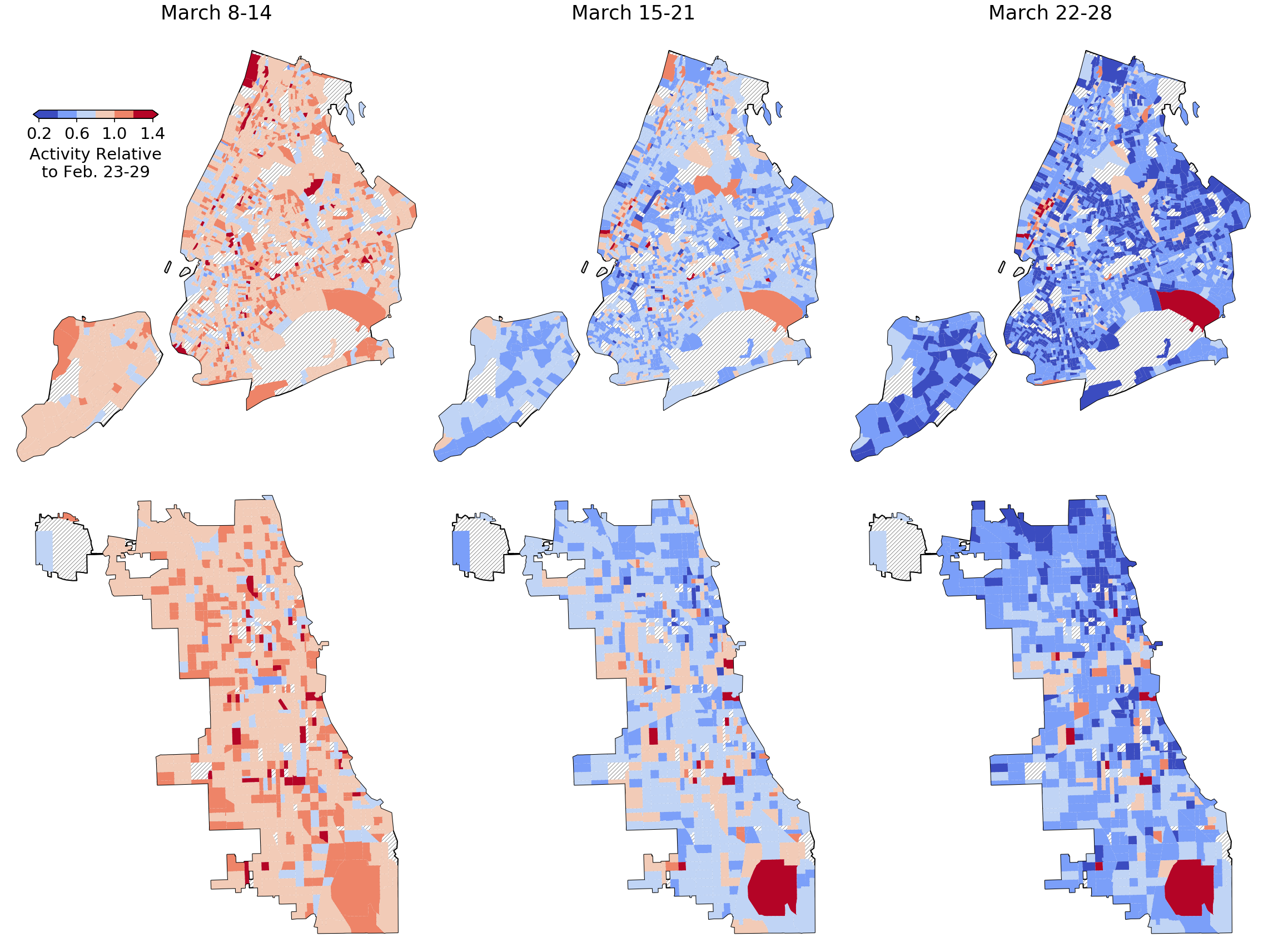
But there is geographic variation in these citywide trends. Different groups have been able to respond to different degrees. The maps below show time out of home by Census tract for the final three weeks of March, across New York City and Chicago. At first blush, the response appears fairly uniform, growing stronger by the week.
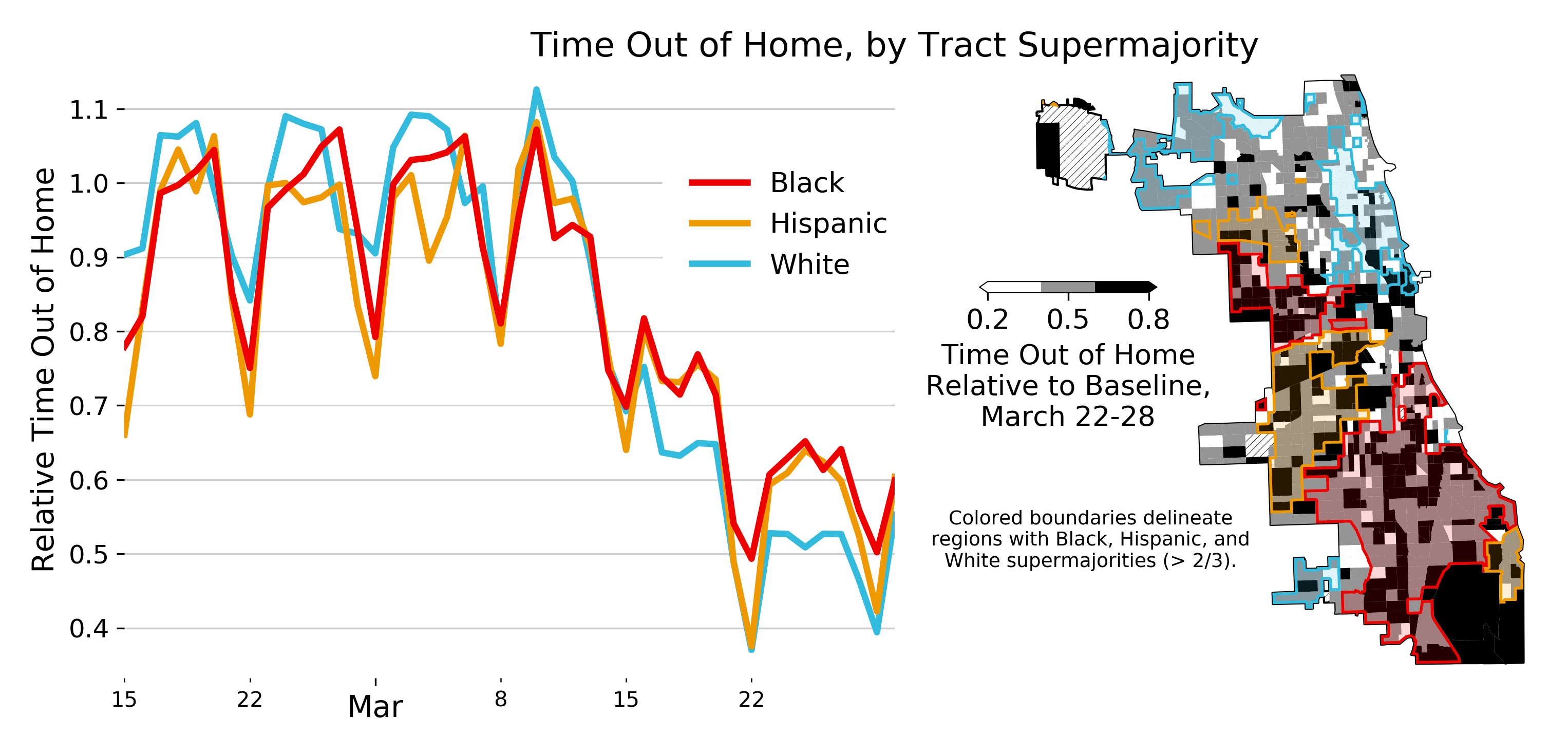
Other firms have looked at divergences by income. But given the disparities by race we’ve seen, I’ll focus there. Here, I’m selecting three groups from Chicago: Census tracts with Black, White, and Hispanic supermajorities (> 2/3). Note of course, that not all tracts are included, since not all tracts are completely segregated. We can then examine the trends in mobility for each of the three groups. We are considering the time out of the home, relative to a common baseline. The plot on the left shows the trends, while the map on the right shows the state of affairs at the end of March. Majority-White tracts start out with moderately higher mobility. As quarantining took effect, the situation reversed. Though mobility plummeted for all groups, Blacks and Hispanics are spending roughly 20% more time out of the home (0.63 instead of 0.52) than Whites.
Quantitative methods allow a more-nuanced view. If that makes you squeamish, then skip the next two paragraphs. In short: the differences in mobility reductions by race and educational attainment are larger and more significant in Chicago than in New York City.
Single-parameter regressions show that in Chicago, wealthier and more-educated tracts reduced out-of-home time more, while tracts with large African American populations reduced mobility somewhat less. (Differential changes for Hispanics were not significant. Note that these regressions require care for correlations between neighborhoods.) To put this in context, let’s consider the change in mobility moving from a tract at the 25th to 75th percentile of fraction Black. In Chicago, those two tracts are 3% and 87% Black, a difference of 0.84. The impact of a one unit change in a neighborhood’s proportion Black is associated with 14% more out-of-home activity level in the final week of March. The reduction in quarantining is thus around 0.84 × 0.14 = 0.12. This is a substantial and significant effect, about one fifth of the city’s overall reduction. Moving from the first to the third quartile (25th to 75th percentile) in terms of educational attainment leads to a 0.23 × -0.42 = -0.097 lower out-of-home activity.
Black neighborhoods also see higher continued activity in New York, but the effect there is smaller: sticking with the difference of the first and third quartiles, it’s 0.41 × 0.101 = 0.04. New York neighborhoods with smaller Hispanic populations and higher adult educational attainment both see higher continued mobility (0.3 × -0.062 = -0.018 and 0.257 × 0.112 = 0.029), without any additional controls. However, these effects are numerically small, and just graze the conventional thresholds of statistical significance. It is worth noting that the picture changes somewhat if we expand the study area from the city limits to the broader metropolitan regions. In that case, the statistical significance of the findings on educational attainment in New York evaporates.
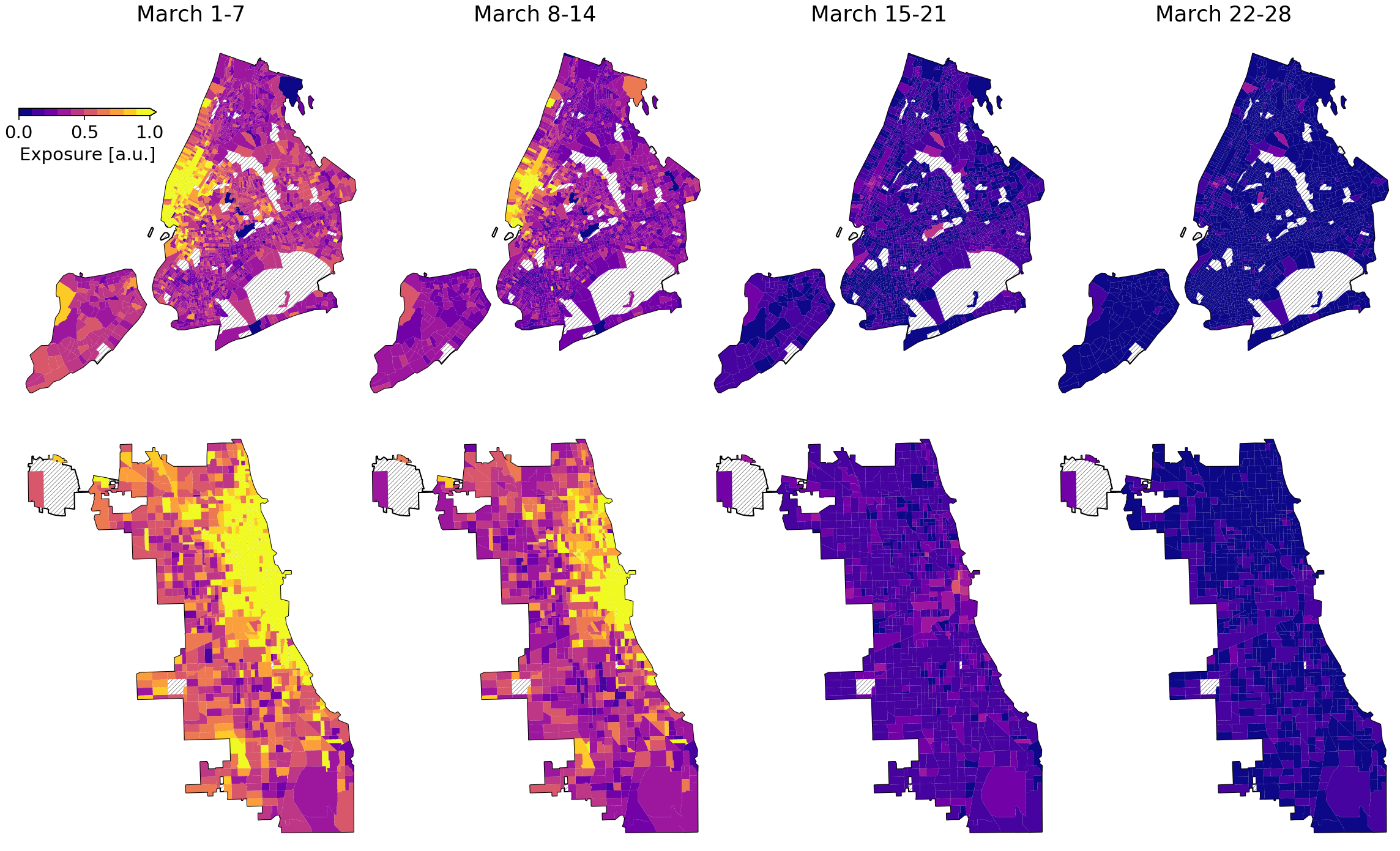
This analysis has concentrated on the variation in continued contact that would expose people to the virus in the first place. It is useful to point out that exposures before the pandemic were very unequal. The busiest locations in New York and Chicago – Midtown and Lower Manhattan, and Chicago’s Loop – are spaces used disproportionately by elites. Looking at changes in exposures in daily routines shows that Manhattan and Chicago’s North Side had the highest initial exposures. Out-of-home exposures depend on two factors: the time spent in various destinations, and the congestion of those destinations. Both of these factors have fallen: each individual is less mobile, as are all of the individuals. Exposures in both cities have thus fallen to a tiny fraction of their initial levels, reaching so close to zero that differences across the city are dramatically reduced.
Still, mobility hardly captures the full story. Changes in routines are not equally costly for all. Some can work from home and others can’t. Healthcare accessibility and preexisting conditions will affect outcomes for individuals actually infected with the disease.
Other Measures
Mobility can be assessed in a number of different ways. In addition to measuring the time out of home, I alluded above to congestion and exposures to other populations. One can also measure the use of specific amenities. A limitation of this work is that GPS data have poor altitude precision. Congestion by floor in an office tower is hard or impossible to measure.
One amenity that is particularly amenable to these data is parks. Since parks exist almost exclusively at ground level, no altitude information is necessary. Park boundaries can be readily extracted from OpenStreetMap data, which is quite accurate for this purpose. Chicago Mayor Lori Lightfoot closed the city’s prized lakefront, to reduce nonessential interactions. Just as warmer weather led to exploding park use a year ago, the Unacast data now show it plummetting – visits are now just 1/3 of last year’s level.

Thanks to Unacast for the data underlying this work, and to Amazon Web Services for the computing credits used to perform the analyses.