Paper Mountains: Pirates, Joy Plots, Mountains, and Lasers
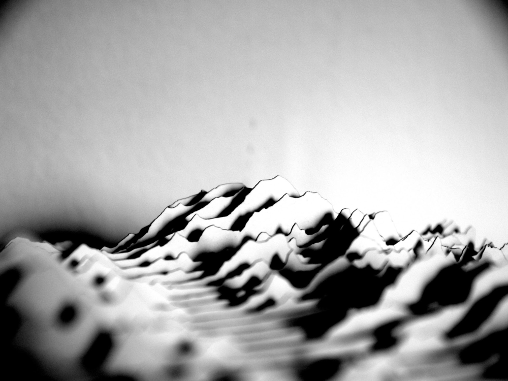
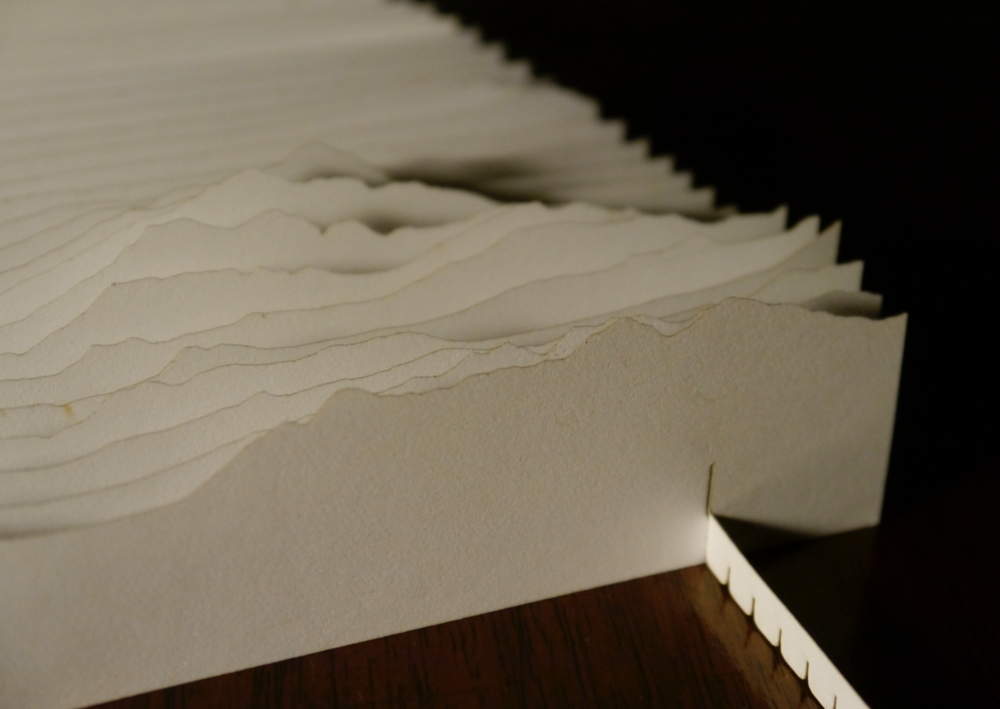
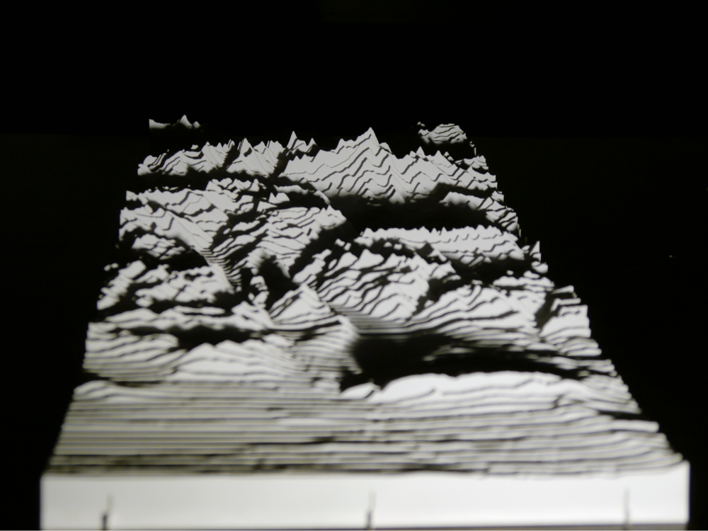
Mount Denali, traced, laser cut in paper, and photographed. (Click to expand.)
I finished the semester, and grading, and I wanted a little break. I decided to make mountains out of paper. This was a long and winding road — a project I’ve returned to over and again — so I’ve already given you the punchline: the image above. If the rest is tl;dr, there are more pictures at the end.
The project had four competing motivations or inspirations:
- Repurpose favorite elements of historic maps.
- Play with raster data — in particular, digital elevation models (DEMs) — since most of my work is with vector data.
- Try out the resources of the Hack Arts Lab at the University.
- It’s a gift.
I started from All Over the Map, which is one of my favorite books of old maps. It is a more expansive and enjoyable alternative to standard, prescriptive texts on cartography, and a better creative spur. They have an amazing blog. One of the map styles that I found particularly compelling were these 17th century Spanish harbor maps (derroteros), stolen by pirates (so exciting!):
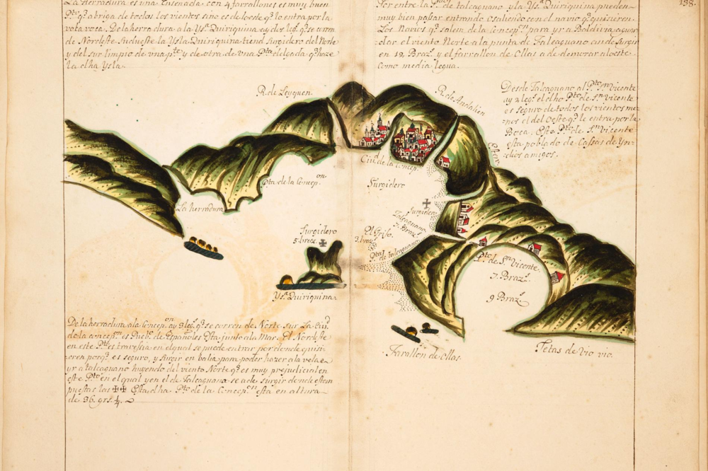
Spanish derrotero (maritime atlas), believed to have been captured as booty by pirate Henry Morgan.
Credit: Hungtington Library, HM 918, Map 138. (Click to expand.)
Distinguishing features are accentuated to assist safe entry into the harbor. The maps are designed for fast visual correspondence to the actual geography. The hills are laid out behind the shoreline, layered by distance from the observer, in a manner both beautiful and intuitive. The layering is what I sought to emulate.
This got me thinking about maps as pictures: using data, elevation, etc. to recreate recognizable mental maps. This is hardly a new idea, of course. One of the “reference” applications of this type of map is for ski areas, which show oblique views of the site, possibly contorted to show routes on the back sides of slopes, etc.
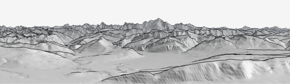
Oblique topographic maps are not new either. Ulrich Deuschle made an incredible tool that allows you to create any vista in the world, as has Fabio Soldati (PeakFinder). See, for instance the views of Mt Blanc from Geneva, below. Jonathan de Ferranti created a similar project, with very nice results, though his code is not terribly accessible (almost machine language, he says). Google maps can do this as well: see again, the view towards Mt Blanc from CERN. And in fact, the software is broadly available: it is fairly straightforward to plot 3D objects in matplotlib, with ogr/gdal, or with Tyler Morgan-Wall’s incredible rayshader package in R. (See this nice view of Denali from the USGS.)
View of Mont Blanc from Geneva, using Ulrich Deuschle’s Panorama tool. (Click to expand.)
View of Mont Blanc from Geneva, using Fabio Soldati’s PeakFinder. (Click to expand.)
So similar products exist (I’ll pick this up again, below), but I was focused on this visual idiom from the harbor maps of layering by distance from the observer. Specifically, I wanted to stack nearer views on top of further ones to make a vista.
You can get Digital Elevation Models (elevation data) for the United States from the US Geological Survey’s National Map. For Europe, Open DEM is a good place to start. In either case, the data come in a grid, so you point-and-click download a few to figure out the file structure, and then jump to wget or curl to iterate and assemble what you need. You can then unzip these, stitch them together, and project them into one big grid in a local coordinate reference system (CRS). This is pretty quick, and lets us jump to python.
gdalbuildvrt big_dem.vrt ./*.img
gdalwarp -t_srs EPSG:3467 big_dem.vrt -overwrite denali.tiff
Here the CRS is EPSG 3467, the Alaska Albers projection, for Denali. You can use spatialreference.org to find appropriate projections. For Europe (below), I used 3035.
If you want to visualize your data at this point:
gdaldem hillshade big_dem_ak.tiff -of PNG big_hillshade.png
For a classic, 2D terrain map, you would then generate a color-relief and combine the images with ImageMagick (see this project). I’ll veer instead into python land.
We’ll proceed in two steps. First, I’ll read through the data to make a 2D image out of layers. Next, I’ll use matplotlib to design a template for a laser cutter to actually produce the individual layers, along with “struts” to connect them and lock them together.
Read it in and plot it out:
import rasterio
import numpy as np

with rasterio.open('mountains/denali.tiff') as ds:
    arr = ds.read(1) # which band — otherwise all

marr = np.ma.masked_where(arr < 0, arr)
plt.imshow(marr, cmap = “viridis”)
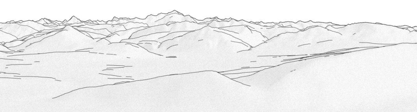
A fun challenge of these visualizations is to find an elevation and angle that gives a clear vista of the scene. You can do this either just looking at the array or exploring the location in Google maps. I plot these out, to lay out my panorama. Once you’ve figured out the locations to observe, the elevations are just the coordinates in integers, within the array.
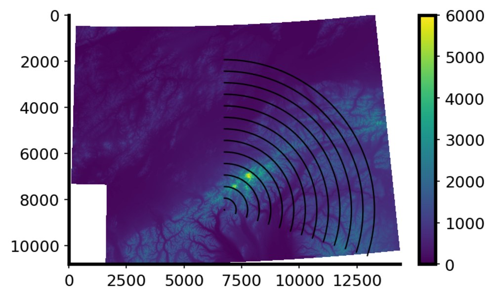
The (x, y) scale is now in weird units: pixels in the projected geometry. To figure out the (x, y) scale relative to z (elevation), I divide the array into two parts, and find the argmax on either side. This gives me the location of the tallest mountain in the two halves. I can then compare the Euclidean distance between these to points to the real-world distance between the two mountains. I contrast that with the known height of the mountains.
Finally, I plot one elevation line over another concentrically moving towards me. I scale the difference in height from the “observer’s” elevation, by the distance from the observer. The result is much analogous to a camera (except that I don’t flip it).
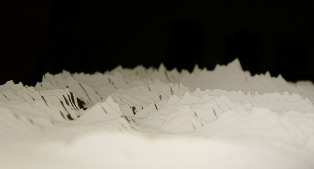
This gave me nice views of Denali. Though this is just a simplistic strategy for oblique hill-shading, the pencil-drawing aesthetic makes for distinctive, dramatic images.
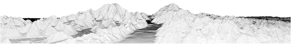
A view of Denali and Foraker, up the Kahiltna Glacier. (Click to expand.)
Next question: can I actually make the mountains? The obvious way to do this is to 3D print a paperweight of your area. Other software (rayshader) will help you there — have fun! — but I wanted to cut them. (Actually, I originally wanted to paper cut a topographical map so that each cut was a constant elevation. But the paper will curve away from the contour lines according to Young’s Modulus. Solution? Scoring or pre-cutting the paper. File under “Future Work.”)
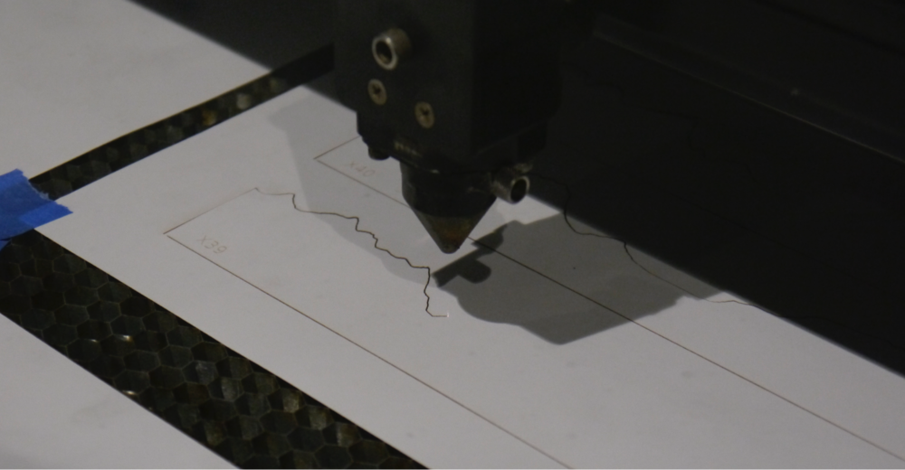
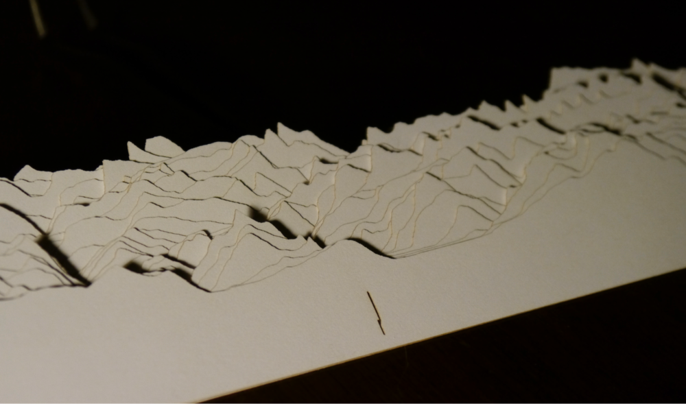
It turns out to be ludicrously easy to use laser cutters to make these mountains. To do this, we draw each slice of the mountain with the appropriate line thickness in red (for cut), and affix little raster labels in case they get mixed up.
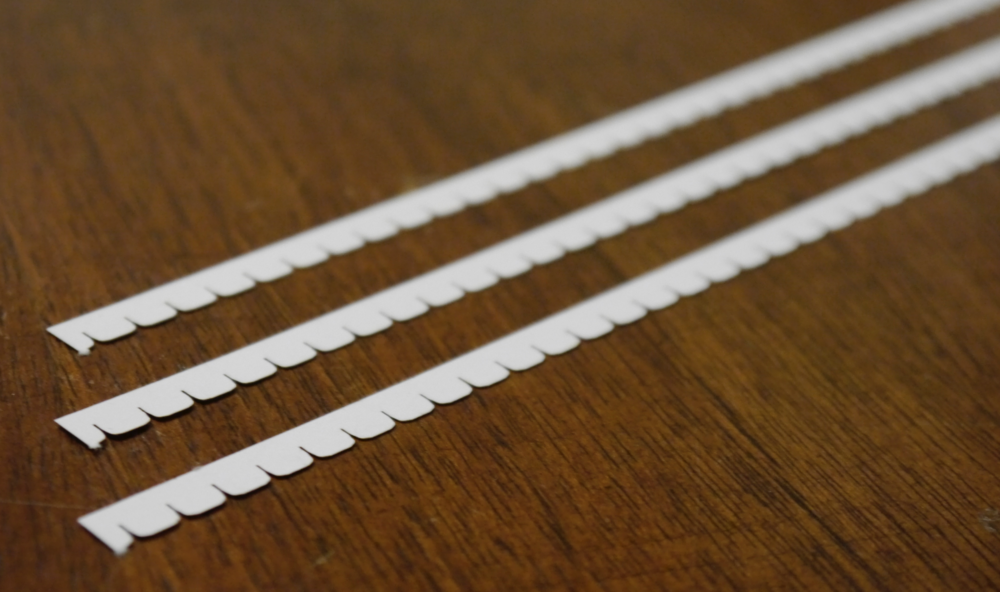
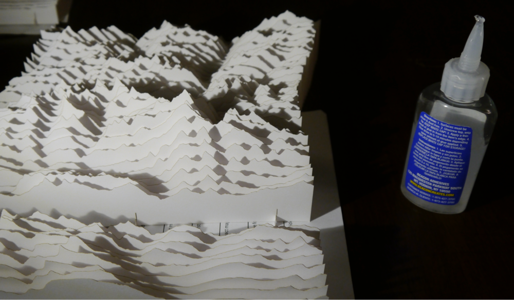
The only additional piece that we need are struts to hold up the strips. This involved several iterations. I first tried interleaving cuts, every other one up or down. The assembly was frustrating and resulted in a lot of torn paper. Next I tried just setting the mountain strips down on the struts. This worked fine for a first pass (Mount Denali, see below), but it was unstable once assembled. My final strategy was to create broad holes through which I threaded the struts. The struts and the holes were designed to latch permanently into place. Getting this right required some refinement, but ultimately worked well.
To the laser! Cut the mountains:
and the struts:
Assemble:
Note the very particular shape of the holes, that allows this:
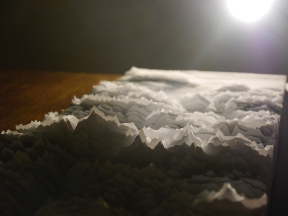
At this stage, I like to think that the stacked layers have something of Tara Donovan’s Transplanted. Can one not dream?
Glue together the struts for long segments:
We can now see from the East past Mont Blanc towards Lake Geneva
Past Mt Blanc towards Geneva. (Click to expand.)
Or in reverse, from Geneva, past the Salève and the Môle, to the confluence of the Giffre into the Arve, and then up to Chamonix and Mont Blanc:
From Geneva to Mt Blanc. (Click to expand.)
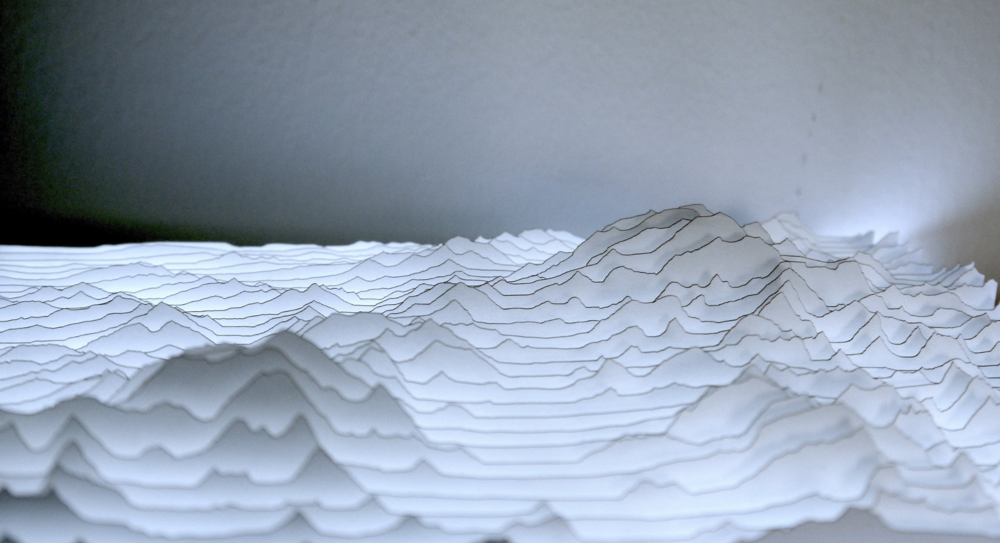
One thing that I love in the result is the ability to “get into” the mountain. If you get your eye right at the level of the map, you really feel yourself in the Alps: the perspective works, and as you look around, the mountains flicker in and out of focus. Having lived in this space, it is recognizable. Looking up the Arve:
The Arve. (Click to expand.)
I was also happy to find that the whole panorama collapses very easily for storage (as designed). Good thing too, since it’s not so small, and it was intended as a gift.
In an earlier iteration, I cut Mount Denali and Mount Foraker, as shown at the beginning. Placing these on a light board creates a dramatic effect. The burnt edges of the paper suffice to make faint lines along the topography.
Up the Kahiltna Glacier to Denali, paper cut mountains on light board.
Up the Kahiltna Glacier to Denali, paper cut mountains on light board. (Click to expand.)
Once I had completed the project, several colleagues noted that the final product looks a lot like the Joy Division cover. I can’t deny that, but trained as a physicist, I would argue that it’s really Jocelyn Bell Burnell’s Cambridge Pulsar 1919 (AKA CP-1919, AKA LGM-1), as plotted by Harold Craft. At any rate, this got me searching for “joy plot maps,” and oh my goodness, lots of people have done this. My favorite was from Travis White, of Crater Lake National Park. Finally, I found this project by Paul Haeberli which, though not mountains, did everything I imagined with laser cutting, back in 1996.
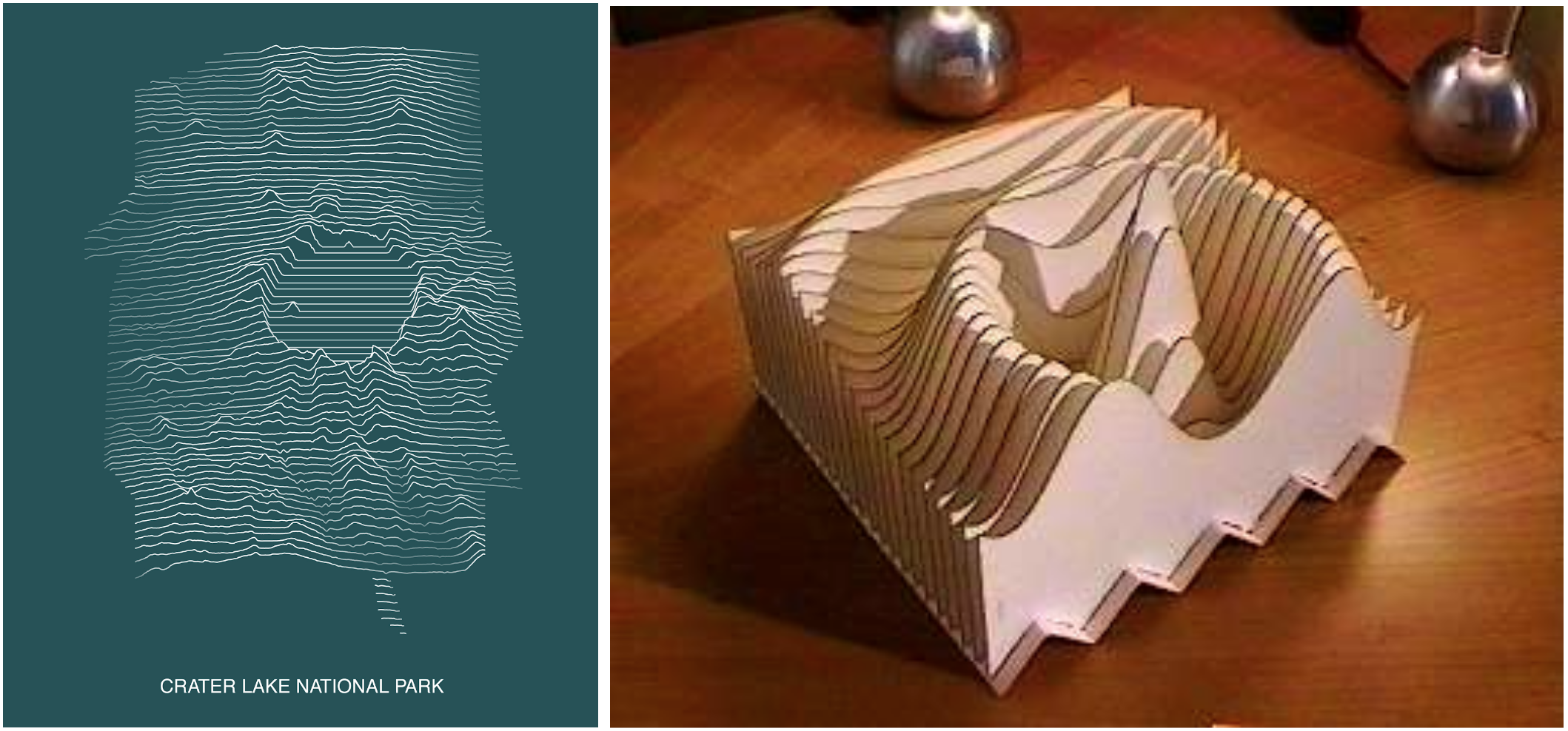
Crater Lake National Park by Travis White, and a laser-cut 3D function by Paul Haeberli. (Click to expand.)
So not only are the “old” parts of the map old, the new ones are too!